Create A Custom Sticky Menu With Squarespace
Today I am going to show you how you can make a cool sticky header effect in Squarespace.
We’ll move the menu after the first section on the page and then make the menu sticky so that it will automatically stick to the top of the screen when you reach it.
Here is what it will look like:
This idea came from a project where the client wanted to have the menu positioned below the very first section on the page. You could try to recreate a custom menu below the first section but this is more trouble than it’s worth. Instead we can use a simple script to move the header below the first section.
Requirements #
- Squarespace 7.1
- Business Plan
Adding the code to move the header/navigation #
The code for doing this is very simple. There are three parts to it:
- First we get the header
- Second we get all the sections on the page
- Finally we move the header to after the first section.
Add this code to Settings -> Advanced -> Code Injection -> Footer
<script>
    (function () {
        window.addEventListener('load', function () {
            var header = document.querySelector('header');
            var sections = document.querySelectorAll('section');
            sections[0].after(header);
        });
    })();
</script>
How To Make the Menu sticky #
In order to make the menu stick to the top of the page when you scroll, you’ll need to add some CSS.
To make the menu sticky simply add this code:
Add this code to Design -> Custom CSS
header {
    position: sticky !important;
    position: -webkit-sticky !important;
    top: 0;
}
What Is The Difference Between Fixed and Sticky? #
Squarespace gives you the option to toggle the header to Fixed Position in the Site Header settings:
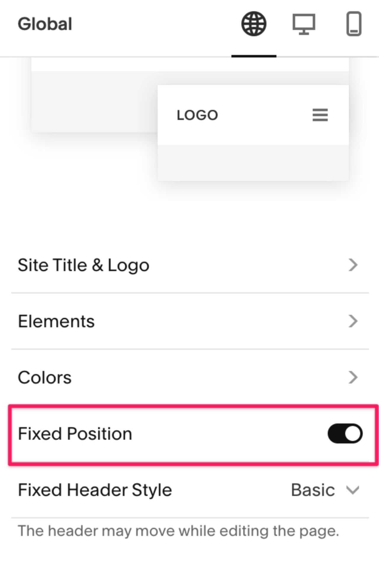
Fixed takes the element out of the document flow and positions it based on the top, bottom, left, right properties. The scroll position doesn’t affect elements that are fixed, they’ll remain in the same position regardless of where you scroll.
Sticky keeps the elements order in the document flow and only takes effect when the element reaches a specific position based on the top, bottom, left, right properties.
Setting top:0 will cause the element to stick to the top of the window.
Setting bottom:0 will cause the element to stick to the bottom of the window.
That’s a little tricky to follow, the best way to understand is to see a demo. In the CodePen demo below we have 2 layouts. The one on the left has a header that’s using position:sticky and the one on the right is using position:fixed.
If you pay attention to the HTML you’ll notice that the fixed nav is below the first section but it appears at the very top of the page. This demonstrates the effect that position:fixed has an on element.
Another thing to note is when using sticky nav your elements can overlap. When you scroll the demo you’ll notice when you reach other sticky elements they’ll begin to overlap. This isn’t possible with fixed elements because they’ll always overlap regardless of the scroll position.