Fix Wide Text In Squarespace 7.1
A very common problem I’ve seen on Squarespace sites is realllly long lines of text i.e. the line-length is too long.
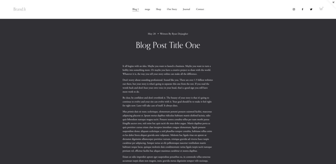
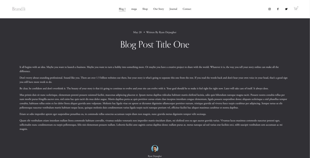
You’ll commonly see this on blog posts, but the issue can also appear on non-blog post pages.
Today I’m going to show you why long line-lengths are a problem and how you can fix this in Squarespace 7.1.
What Causes Long Line Lengths? #
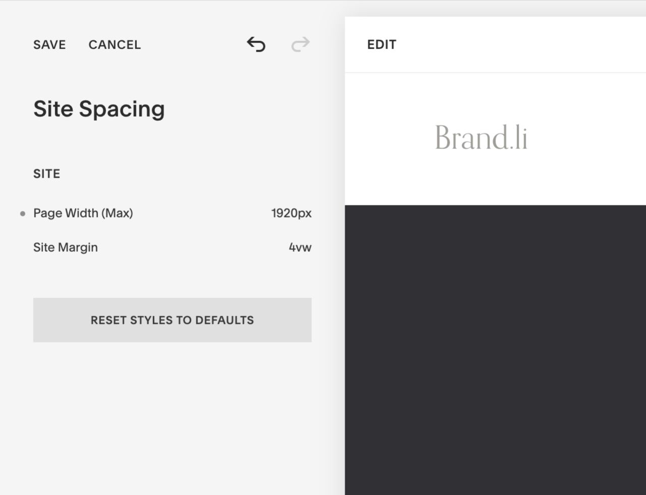
The reason this happens is often from people setting a wide page width.
This is often done because people are trying to create full width sections on their site but not realizing that this affects the blog content width.
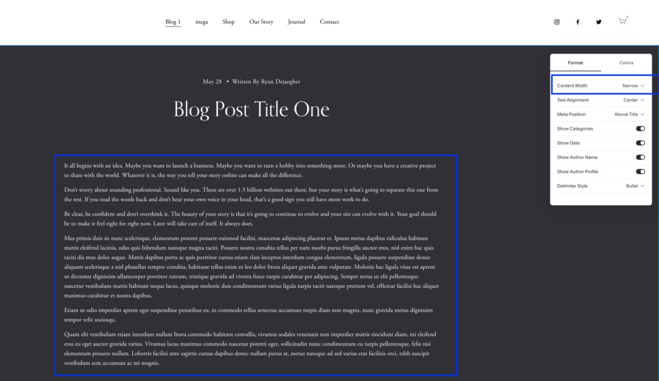
Sometimes you can fix this with the content width settings in your blog. This can work but not always.
So if the page width is really wide, even setting the content width to narrow may still not be enough to fix the issue. See the example below of the content width set to narrow
The Problem With Long Line-Lengths #
Having really long lines of text can impact the readability and scanability of text on your site.
If line-lengths are really long then the visitors eyes have to do more work because they have to travel longer distances across the screen.
The opposite can also be problematic, if line lengths are too short, our eyes are working hard because they’re moving back and forth so quickly.
This problem usually isn’t noticeable on mobile because the width of text is often constrained by the device size.
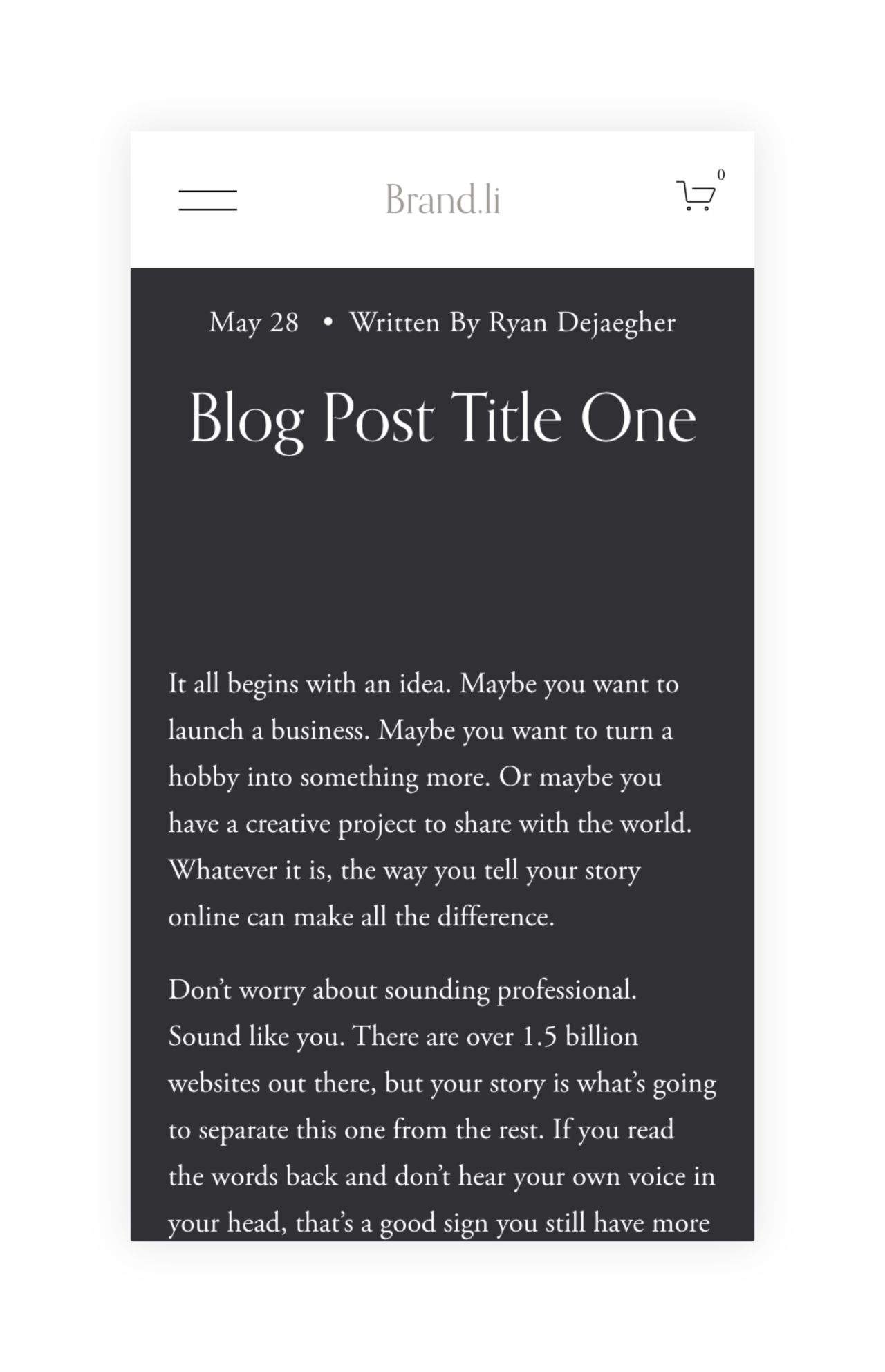
The problem is more noticeable on larger screens.
If there’s nothing to constrain the width of the text then it will stretch to fill the available size.
The Solution: Constraining the Text Width #
We can fix the line-length issue by constraining the width of the text. But how do we know the right width/line-length for our text?
Luckily Google’s Material Design Guidelines can help us out with the ideal line-length:
Line lengths for body text are usually between 40 to 60 characters. In areas with wider line lengths, such as desktop, longer lines that contain up to 120 characters will need an increased line height from 20sp to 24sp.^^ - Material Design
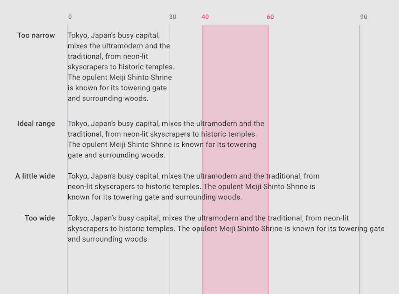
So the goal is to constrain our text width so that the line-length is between 40-60 characters.
We can use CSS and the EM unit to set our text width relative to the font-size and get close to that character range.
What is the EM unit? #
EMs are known as a relative length unit. It’s value is based on the nearest element’s font-size value.
So if the font size for the blog is 16px, then 1em = 16px.
- 2em = 32px
- 3em = 48px
- etc.
The benefit of using EMs for controlling the text width is that creates a relationship between the font-size and the text-width.
So if the font-size changes the text width will change as well.
Adding CSS To Fix #
Now lets add the code to fix the line lengths. We’re going use a media query so that our styles only apply on tablet sizes and up, since this is often where the issue is.
We’re going to target the .blog-item-content-wrapper. This is the class in Squarespace 7.1 for the main text of a blog post (not the title or metadata).
We’re going to set max-width and margin.
<style>
  @media (min-width: 768px) {
    .blog-item-content-wrapper {
      max-width: 36em;
      margin: 0 auto;
    }
  }
</style>
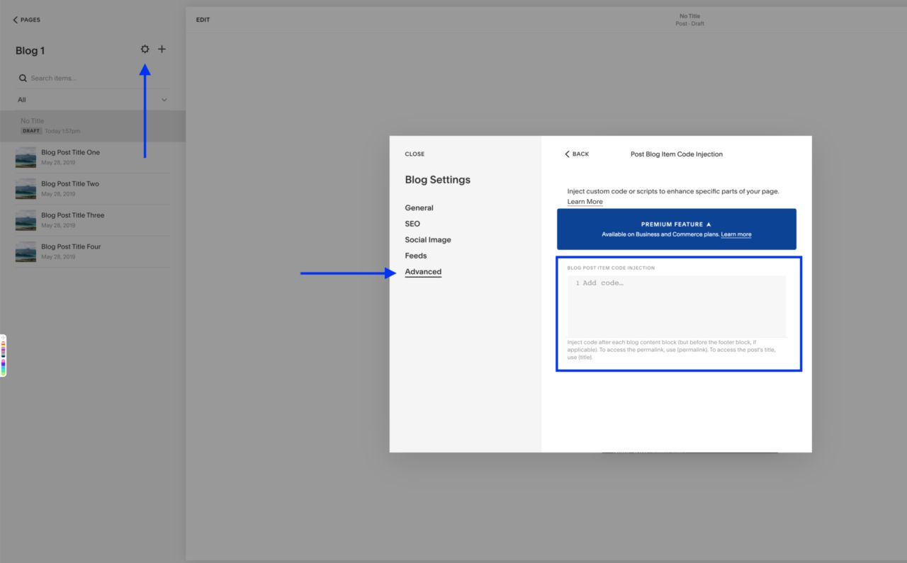
If you want to easily fix this for all your blog posts by adding this CSS to your Post Blog Item Code Injection
The margin:0 auto ensures that the text container is centered. And the max-width is 36em.
According to this article from Simon Li, a good rule of thumb for the max-width on desktop is between 34-36em.
Once you’ve added the CSS to your site, the line-length for your blog content should be closer to the ideal range (between 40-60 characters).