Get Product Thumbnails Back on Mobile in Squarespace 7.1
There was a question in the Squarespace Customization Resource Group about how to get the thumbnails for products to be visible on mobile in Squarespace 7.1
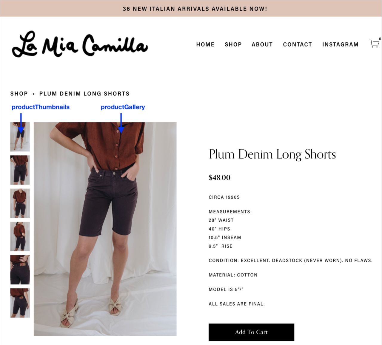
I am trying to display thumbnails for my products on MOBILE under the main large photo on my product details pages. It’s a 7.1 version template. Right now it’s just displaying one photo at a time on mobile like a carousel which is not super mobile/user friendly!
Today I’m going to show you how you can add the thumbnails back on mobile using JavaScript.
The Problem #
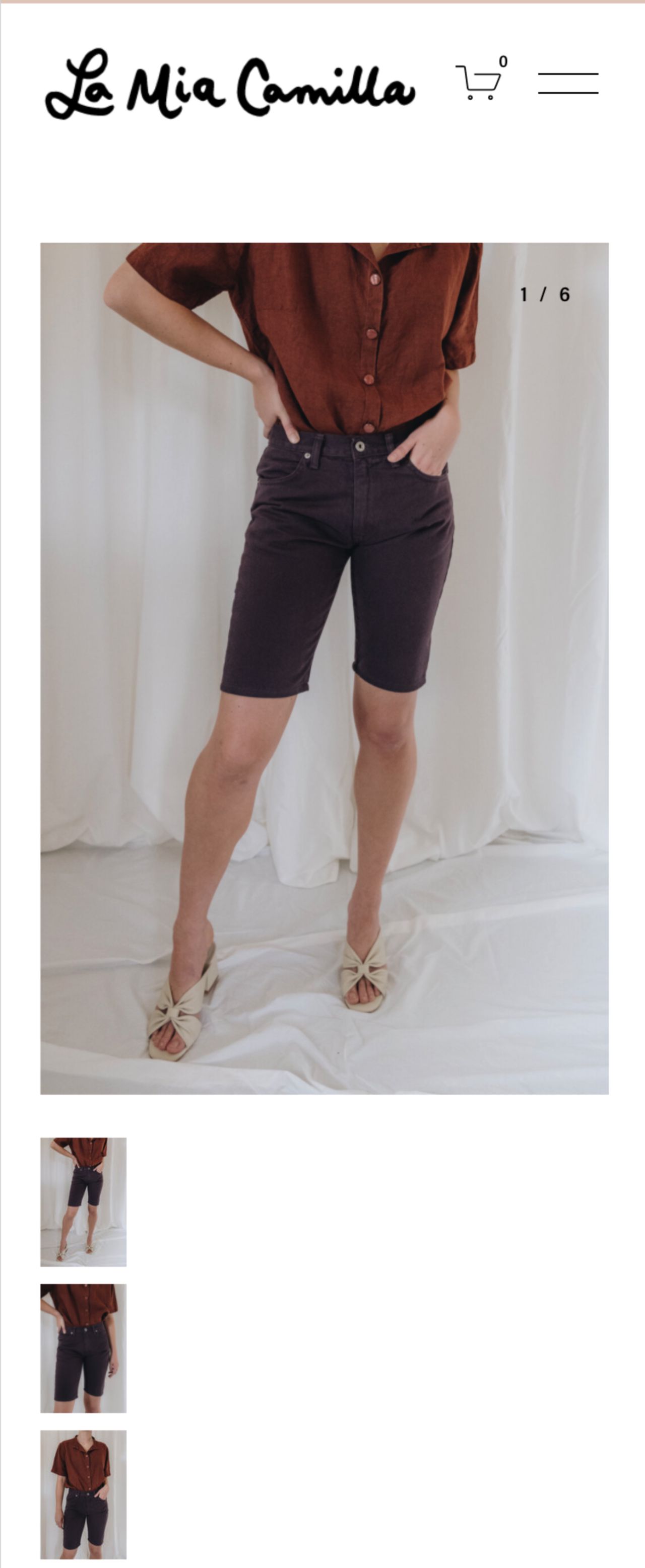
By default Squarespace removes the thumbnail images on mobile, so visitors have to rely on swiping through the images one by one. Visitors may not even realize other product images are present.
The other issue if you have multiple images. If you had 10 images a visitor would have to swipe through 9 times to get to the last one. If the thumbnails were present they could jump to the image they want to see with one tap.
Unfortunately CSS alone won’t fix this issue because Squarespace removes the src on the image pointing to the thumbnail file, so even if you can display the image with CSS it’s not actually pointing to a file.
For this we need JavaScript.
The Solution #
We’re going to write some custom code i.e. JavaScript that will get the product thumbnails back on mobile in Squarespace 7.1.
This is what we’re looking for
What This Script Will Do #
Let’s break the script down a bit and walk through all the actions we need to take to get the thumbnails back on mobile.
- Get the thumbnail images that are hidden on mobile
- Move them from their desktop position to after the main product image on mobile
- Add some custom CSS and styles so that the images fit into a row instead of a column to prevent the page layout from getting too long
- Move the thumbnails back to their original location when visitors are on tablet and desktop and set the layout back to a column instead of a row.
Compatibility/Requirements #
- Squarespace 7.1
- Requires Business Plan (Code Injection)
This tutorial is all JavaScript. If you’re not comfortable with code injection or JavaScript I’m available for custom development. If you are fearless, then continue!
Writing The Script #
Everything we’re going to be doing will take place in the Code Injection (footer) in Squarespace (Settings -> Advanced -> Code Injection -> Footer)
The code examples below will build on each other and explain what’s happening.
Step 1. Create a script tag in Code Injection #
When you’re adding JavaScript to code injection, it needs to go in between <script></script> tags. It’s very easy to forget this.
Step 2. Create an event listener to wait for the page to load #
To make sure that the script only runs once the page and images are fully loaded, we need to add an event listener. Event listener’s fire when certain actions or events take occur and one of those events is load.
If we don’t add this the script may run before the page is loaded which could prevent the script from working properly.
Step 3. Get the thumbnails and the main product gallery #
Next we need to create variables to grab the product thumbnails and the main product image.
We’ll also add an if statement to check that the product gallery exists on the page. This ensures the code will only run if there’s actually a product gallery on the page. If it doesn’t exist, the script will stop.
This code will grab these elements from the page.
Step 4. Create a function that will move the thumbnails on mobile and set the style #
Next we’re going to write the function that will move the thumbnail on mobile and give it some custom style so that it displays in a row.
You can think of functions as actions. You write them once and then you can reuse them anytime. Which we’ll do in later steps.
If we didn’t add the custom style the thumbnails would still be laid out as a column like the image below.
Step 5. Create a function that will move the thumbnails back on desktop and reset the style #
Next we’ll write a function to handle moving the thumbnails back to their original position on desktop and reset the style so that they go back to displaying as a column instead of a row.
This code will give you the original layout on desktop.
Step 6. Create a function to check the viewport size #
Next we need to create a function to check the viewport or window size.
This is necessary for ensuring that we run the right function only when the viewport is a certain size. In this case we want to know when the viewport is larger than 767px or smaller than 767px.
Why 767px?
By default Squarespace shows the thumbnails when the viewport is > 767px, which is often the size for tablets and desktop.
This function will check whether the viewport/window width is greater than 767px. If it is, it moves the thumbnails back to their original position on desktop.
If it’s less than 767px, then the function runs the code to move thumbnails on mobile. This is where we’ll also run our functions (addThumbnailsBackToDesktop and moveThumbnailsOnMobile) that we wrote above.
Step 7. Add Event Listener for Resize on the Window #
We’re not done with event listeners yet, we need to add another one to listen for when the window/viewport resizes.
Why do we need to do this? This ensures that script will run when you’re editing in Squarespace and switching between the desktop and mobile views.
If we don’t do this the script would only run once when the page is loaded initially and the code for checking the viewport size wouldn’t run again.
This will ensure the code runs when the window size changes. Everytime the viewport resizes we run the function checkViewportSize which decides whether or not to move the thumbnails on mobile.
Putting it all together #
Now we’re ready to put everything together and test it out. Since we’ve put all of the code inside the the function for the load event listener, the code will only run once the page has fully loaded.
To test out and ensure it’s working go to a product page and switch between desktop and mobile view. If everything is working correctly you should have thumbnails on mobile view now :)