How To Make Wavy Section Transitions In Squarespace 7.1
Update: added fix for SVG leaving a gap at the bottom of the page
At some point after designing some Squarespace sites you’ve probably noticed that your designs are falling into a pattern.
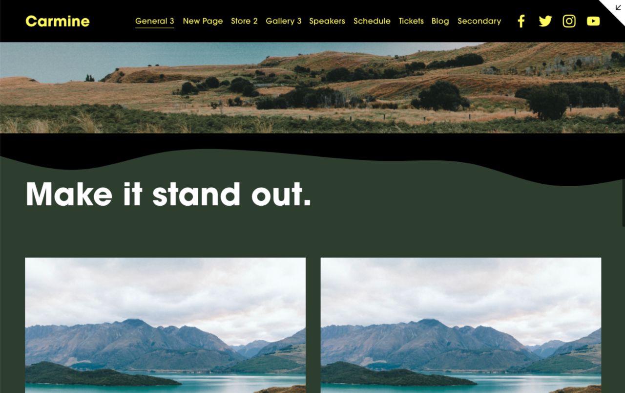
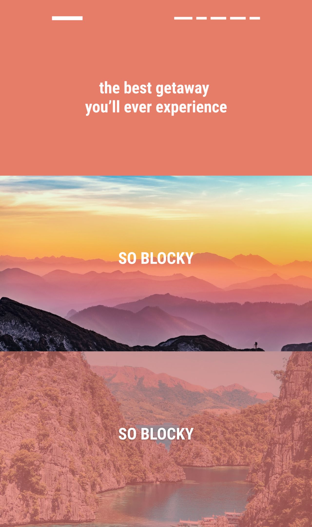
Your site design is starting to feel “blocky".
You just have these sections or blocks stacked on top of each other. It starts to feel a little boring
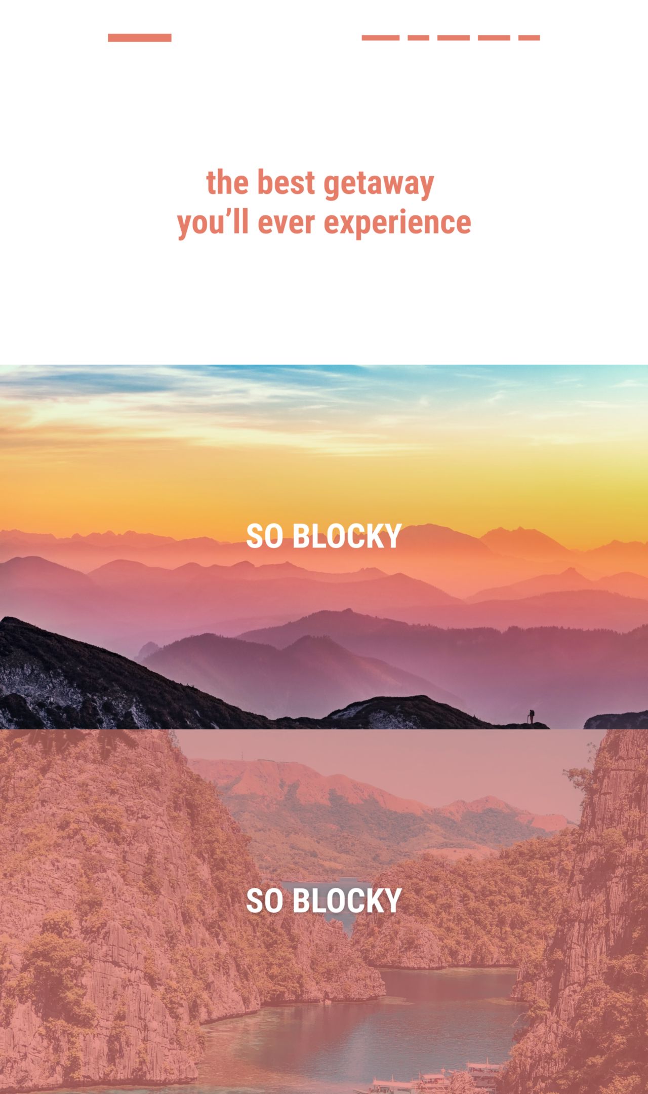
We need a way to break up the monotony and make these sections feel a bit more dynamic.
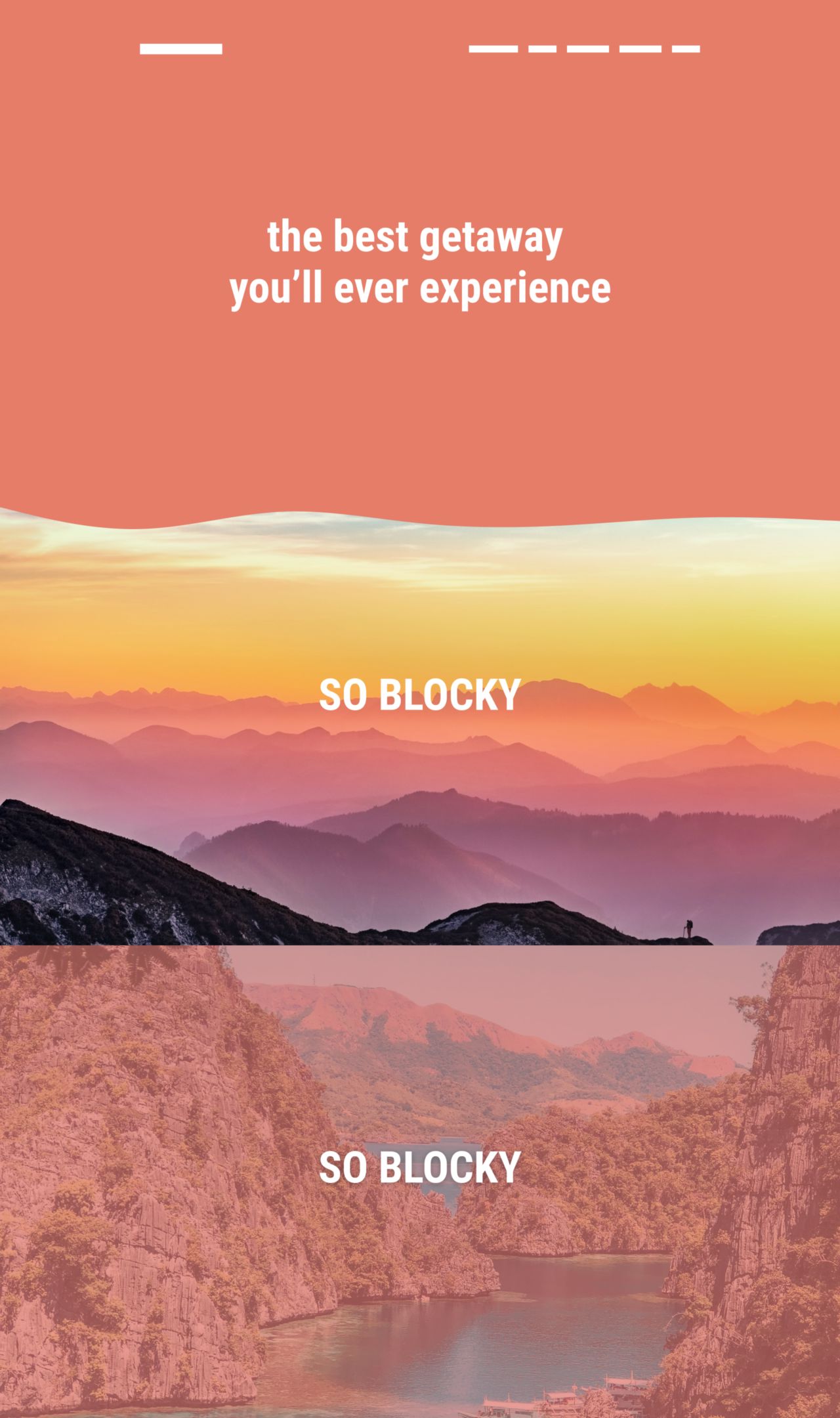
We can do this by introducing some wavy borders.
So we go from having these straight edge sections to more organic transitions between sections.
So today I’m going to show how you can create these wavy borders on your Squarespace site with CSS and an awesome design tool: Figma.
What tools do you need? #
Figma #
Figma is an incredible design tool that can be used in the browser or on desktop. If you’ve been using something like Photoshop or Illustrator I’d highly recommend looking at Figma as your design tool.
Last year Figma introduced a plugin ecosystem which lets developers create new tools that can easily be added to Figma. Which is what we’ll look at next.
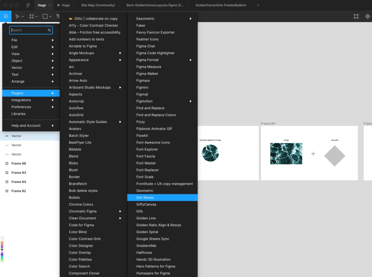
Figma Plugins #
Figma now has a large plugin library. We’re going to be using a free one called Get Waves.
Get Waves is a plugin from zcreative labs that randomly generates SVG waves. There’s a web based version but they also have a plugin for Figma which makes it really easy to use and keep all your work in your project, instead of downloading SVG files from the web app.
Why use this instead of creating an image with a wavy border already applied? #
I’ve seen it suggested to just create a background image with a wave already applied to the image. But we get so many benefits using SVGs for this kind of design.
- It will be responsive since we’re using SVGs (lighter file sizes)
- We could animate the wave if we wanted to
- We can create many variations quickly and we don’t have to keep saving/exporting images
- Since they’re SVG they will take up very little room on our site
- Once the SVG wave is added it can be reused anywhere on your site.
How does this work? #
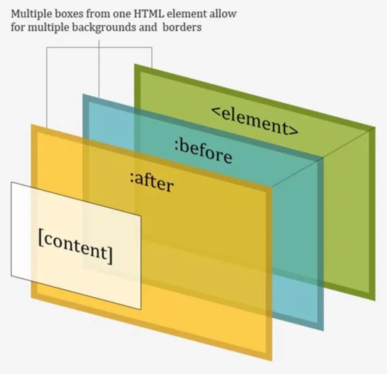
We’re going to create a wave shape that we can use as a clipping path/mask to create the wavy borders.
Just like in Photoshop or Illustrator we can create “masks” or a clipping-mask with CSS and SVGs that will only show content that’s inside the clip-path.
A clipping mask is a shape (called a clipping path) that masks any object below it, so only what’s inside of the clipping path is visible. A clipping path can only be a vector object, not a photo. However, the object below it can be anything – a raster photo, vector drawing, etc. - 99Designs
You can see a demo below of how clip-paths work. We can take a shape like a circle as our clip-path and apply it to an image. Now the only part of the image that’s visible is the part that’s inside the circle.
Flywheel also has a great visual to show how clip-paths work.
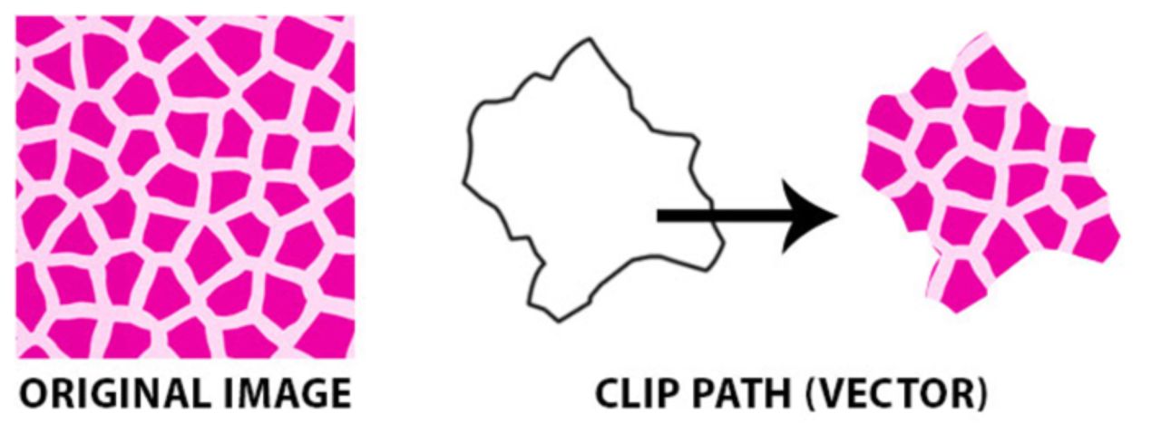
Source: Flywheel
Now let’s start creating waves in Figma.
Step 1. Creating a wave in Figma #
After you’ve opened up Figma, you can install Get Waves for free.
To start using the plugin you’ll need to be working inside a file. You can create a new file by the “+” icon beside Drafts in the sidebar.
To access the plugin in your project you’ll need to click the hamburger menu in the top left corner of Figma and click Get Waves inside the Plugins folder.
Quick tip: if you’re on a Mac you can press ⌘ + /, and it will open the the Search Input and you can search “Get Waves”
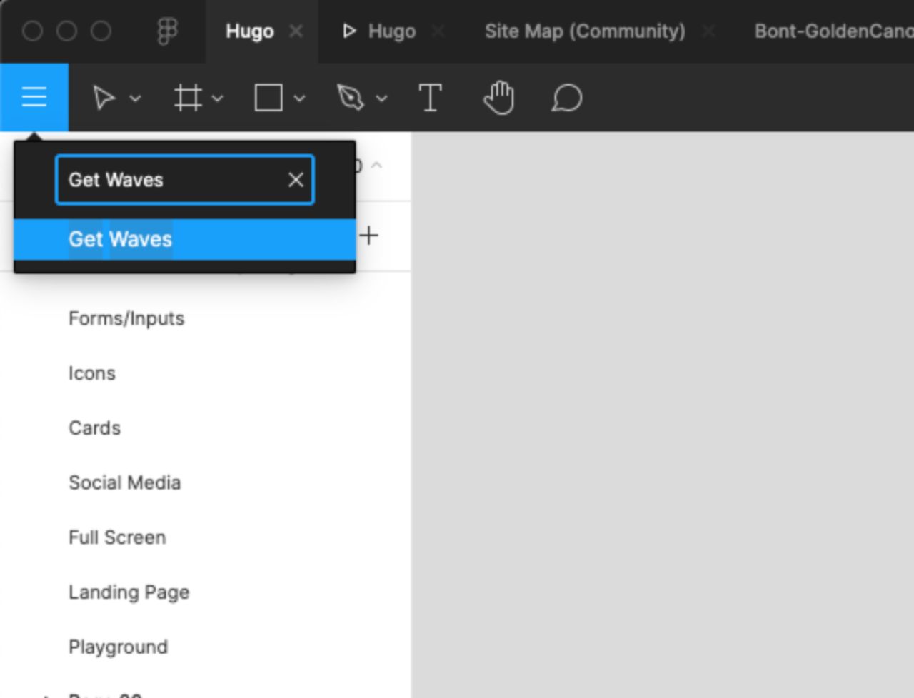
A pop up will open for Get Waves
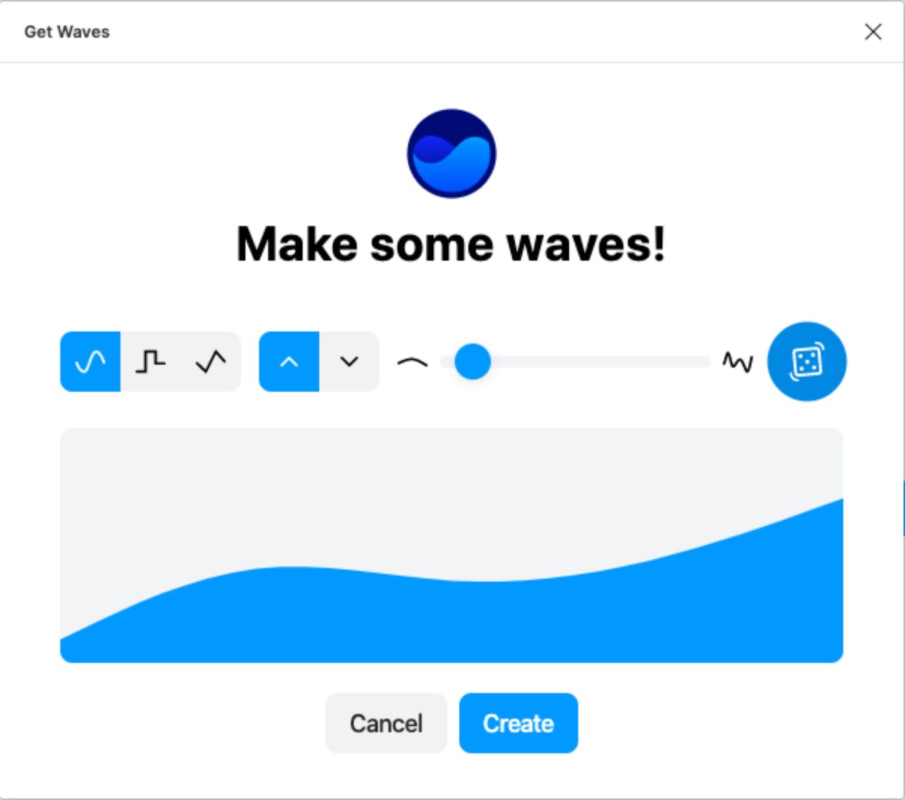
You can start to adjust the settings and it will give you a live preview of your wave. And you can easily get a new random wave by clicking the dice icon.
You can also change the direction of your wave: up or down.
You’ll want to create a wave for both directions. This will let you have waves on the top and bottom of page sections.
Once you click create you’ll have a wave added to your page.
Since the wave is an SVG you can easily resize it without effecting the quality of the image. You can also adjust the height.
I’d recommend setting the height of the wave between 60-120px and setting the width to 1920px.
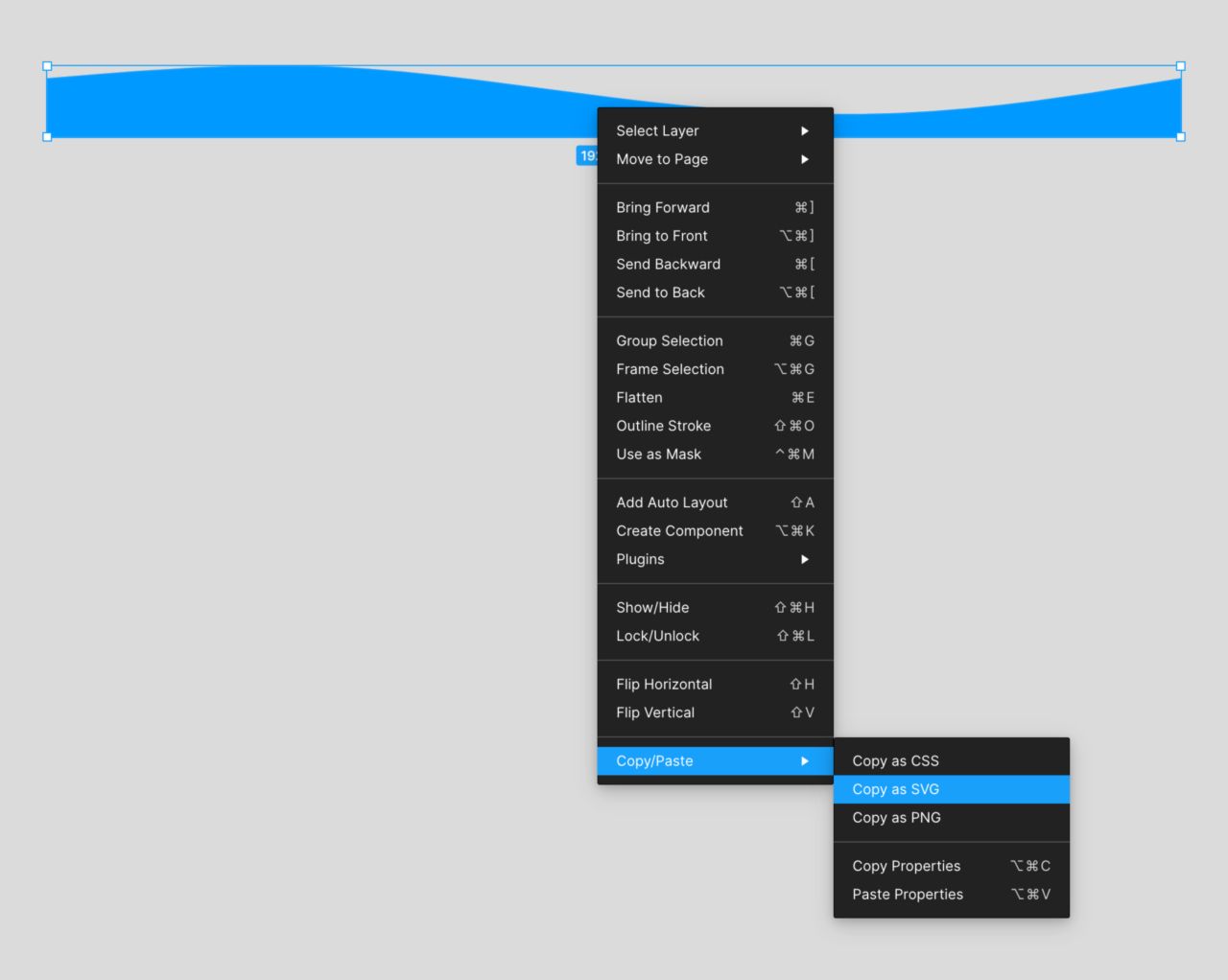
Step 2. Copy/Paste the SVG from Figma to your site #
Figma makes it really easy to get the SVG code that you need. To get it simply right-click your wave, then click Copy/Paste -> Copy as SVG
This will give you the code for the SVG to add to your site.
You don’t have to worry about the color of the wave here because it doesn’t actually appear on the page. The colored part of wave is the part where our clipped element will be visible.
The best part about this is that you only need to add this SVG once, but you can reference it multiple times throughout the site.
If you want to use it on multiple pages then I’d recommend adding it your Site Code Injection (Settings -> Advanced -> Code Injection -> Footer)
Step 3: Adding a clip-path to your SVG #
There’s a couple things we need to add to our SVG in order to use it as a clip-path. By default, when we paste the SVG code from Figma we’ll have a SVG tag and a path (our wave) nested inside.
Your path code will be slightly different because the wave generated by the plugin will be random.
We need to wrap our path in a defs and a clipPath tag And we need to give
our clipPath an ID. This is what is going to let us reference this wave in our
CSS and let us use it as a clipping path to hide/mask elements.
You can use any name for the clipPath ID, just make sure it’s unique and only used once. If you had 2 different wave SVGs their IDs would have to be different.
clipPath id="waveUp"
clipPath id="waveDown"
This is what the code for the SVG should now look like:
Step 4: Making the SVG & clipPath responsive #
In order to make our SVG and clipPath responsive, we need to add a transform
attribute with a scaling effect to the clipPath and set the
clipPathUnits=objectBoundingBox.
The reason we have to do this has to do with the SVG viewBox and the path coordinates. That’s a whole other topic that we won’t dive into.
All you need to know for now is the formula you need to use for the transform
attribute on the clipPath.
The formula is 1/viewBoxWidth, 1/viewBoxHeight, in our case it would be 1/1920 and 1/120.
credit for this goes to Eric Meyer
This will make sure SVG and clipPath fully responsive.
Now we’re actually ready to add the SVG to our site. In order to make this SVG available across the entire site you’ll need to add the code to _Settings -> Advanced -> Code Injection -> Footer _
Step 5: Using the SVG on Psuedo Elements #
Once the SVG code has been added to the Code Injection we can start to use it as a clip-path on our elements.
For the purpose of this demo we’re going to assume that you want to have
full-width waves between sections on your site. Each section in Squarespace has
a unique data-section-id so we’re going to be targeting that.
First add CSS to your sections to set their position to relative. This will allow us to position our wave for that section.
Next we’re going to create a psuedo element after our sections. Psuedo elements let us create additional elements around existing elements. We can use these psuedo elements for styling purposes. This is what’s going to actually make the wavy border.
Source: CSS-Tricks
To mask the pseudo element with our clip-path we can add a clip-path property
and reference the ID from our SVGs clip-path.
By default we’ve added a black background to the wave to make it visible.
So we know the wave is there but obviously this design doesn’t work. Let’s look at 2 design scenarios and how we can make our wave work.
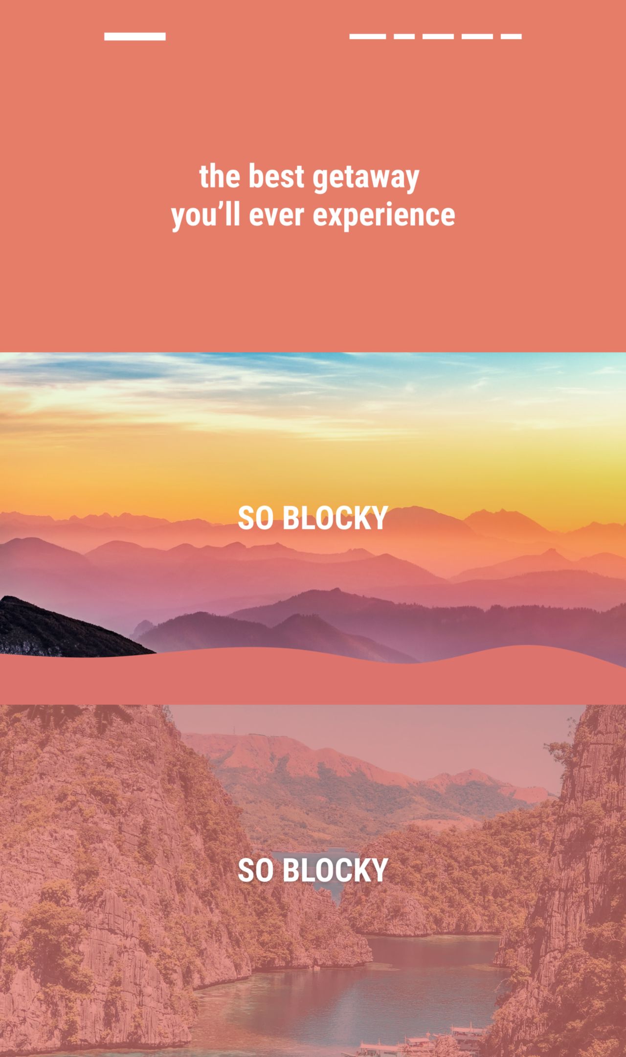
Scenario 1: Color Section To Image Section (Easier) #
The first scenario is pretty straight forward, we have a section with a background color followed by a section with a background image (the first 2 sections). We want a wavy border between these 2 sections.
To make this work we need to add a wave to the top of the second section and set it’s background-color to match the color from the previous section.
Remember when I said you’d want to create 2 waves for each direction (up and down)? Here is where we want to use the wave that’s pointing down.
To apply the wave the second section you can either use the data-section-id or
use an nth-of-type selector. Since we’re targeting the second section we can
write :nth-of-type(2)
Note: if you want to ensure this code is only being applied to a specific
page on your site, you can add this CSS to Page Settings -> Code Injection
and wrap it in <style> tags
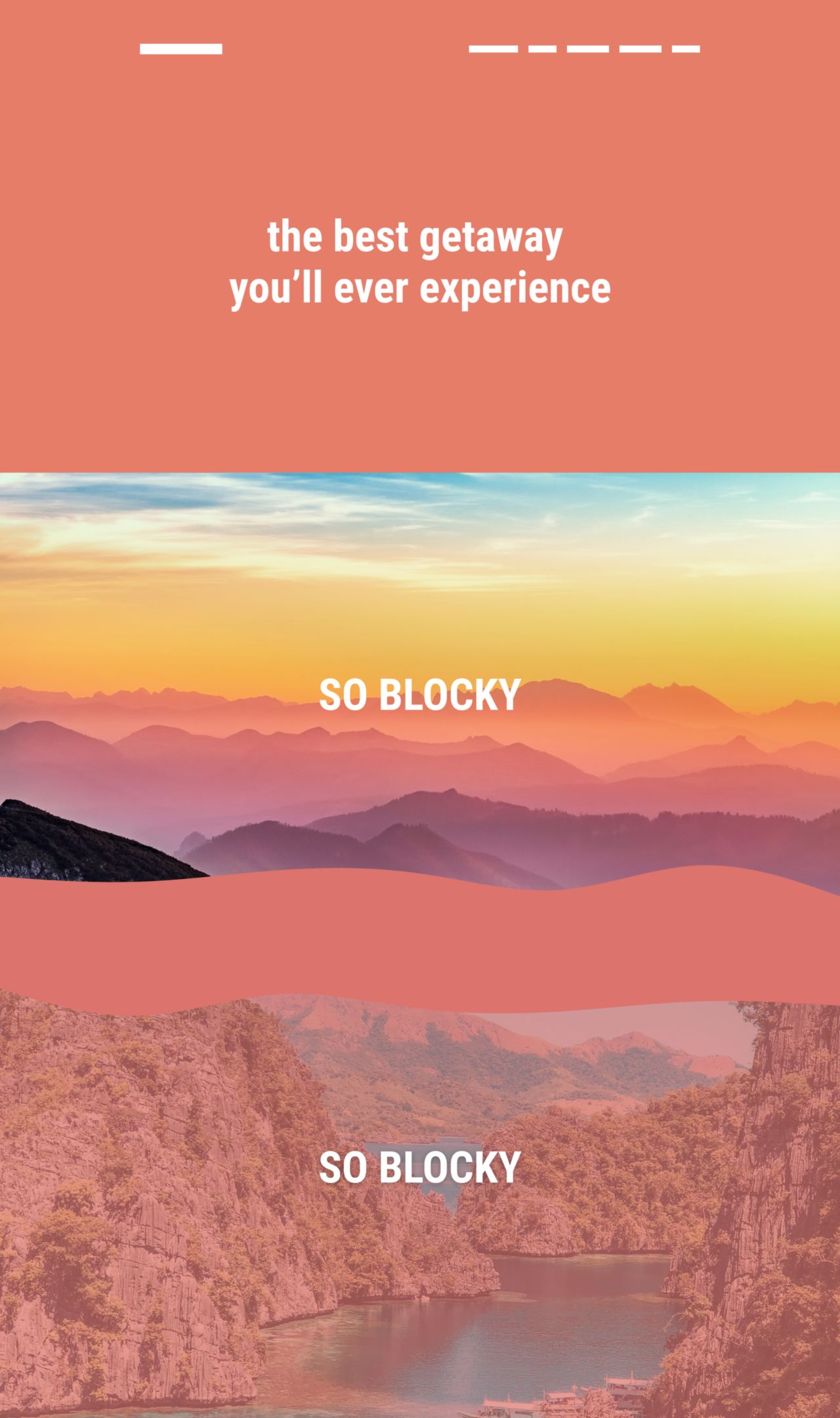
Scenario 2: Wave Between 2 Image Sections #
The second design scenario we have is when we have 2 sections with background-images.
In order to create a wavy border between these sections we need to add a wave to bottom of the first image section that’s pointing up, and then we need to add a wave to the top of second section that’s pointing down and then we need their background color to match.
For this to work we’ll need to have 2 SVG waves and we’ll need slightly different CSS.
For the first image section, we need to position our SVG on the bottom instead of the top and we’ll also need to use the SVG wave that’s pointing up for our clip-path.
This takes care of positioning our wave on the bottom of the first image section.
Now we need to add a wave to top of the second image section. We’ll need to use the SVG wave that’s pointing down. Since it’s actually the third section on the page we can use :nth-of-type(3) to target it.
You should now have a wave between your 2 sections with background images.
Fix: Removing Blank Space At End of Page #
When you add the SVG wave to your site you may notice a blank space at the bottom of your site. Even though you can’t see the wave, the SVG is still taking up height. To fix this you’ll need to add this to your custom CSS:
This won’t remove the blank space at the bottom of your page but your wavy sections won’t be affected.