How To Style Social Icons Squarespace 7.1
Today I’m going to show you some cool ways to style the social icons in the Squarespace 7.1 navigation.
Here are some things we can do:
- Change the fill color when we hover over them
- We can add a stroke to make them outlined
- Or we can add a stroke on hover and remove the fill
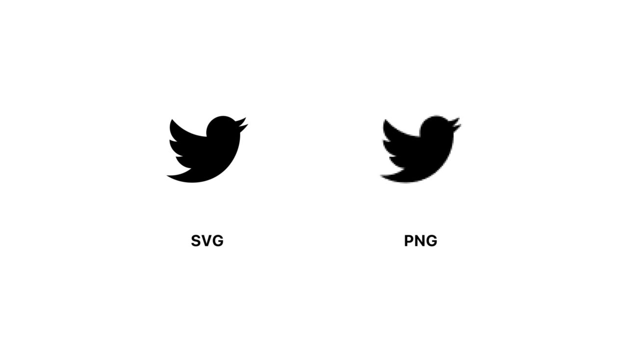
The social icons in Squarespace are SVG. This gives us a lot of flexibility in how we can style them.
Unlike a PNG image/icon, SVGs properties (width, height, fill and stroke) can all be customized with CSS. This is just like creating and working with icons in something like Adobe Illustrator or Sketch. We can adjust various settings for our SVG live on the site, without having to export a different color or different version of the icon.
Today I’m going to be showing you the CSS to customize the SVG color and how to create an outlined social icon. Let’s get started.
Compatibility/Requirements #
- Squarespace 7.1
- Business Plan
Step 1. Targeting the social icons in the header on Squarespace 7.1 #
If you want to target the social icons in the header menu in Squarespace 7.1 you can use this CSS class. This ensures it doesn’t affect other icons/SVGs on the page.
Step 2. Changing the color of the social icons #
If you’ve made customizations to text or background colors before you may be use
to using color or background-color in CSS.
If you want to change the color of an SVG icon the terminology is a little
different, we use fill and stroke. When you’re dealing with solid shapes
(i.e. squares, circles), fill would refer to entire shape.
Let’s change the fill color of the SVG icons:
Your fill icons should be blue now. You can’t do this with PNGs :)

Step 3. Changing the social icon color on hover #
We can make our SVGs a little more interesting by adding a hover effect. You can
add :hover to the end of your class. Now your social icons will change color
when you hover over them.
Whenever we’re animating things it’s a good idea to add a transition so that the change isn’t so jarring. You can add a transition to all the SVGs with this CSS:
Here we’re telling the transition to apply to the fill property and for
transition to take place over 0.5s.
Step 4. Making the social Icons into outline icons #
In addition to the SVG fill color we can also add a stroke to turn them into outlined icons. And again because this is an SVG we have a lot of control over the styling. Let’s hide the fill color of the SVG and add a stroke.
By default when you add a stroke, the stroke-width will be 1.
Although you can make the stroke-width thicker, there’s a limit. If you make it too thick, then the parts of the stroke will start to overlap and the icon will lose it’s shape.
For an obvious example, set the stroke-width:10.

If you have a really small-icon you’re limited by how thick you can make the stroke-width.
Step 5. Turning social icons into outline Icons on hover #
Now that we know how to add a stroke to our SVGs, lets add a cool hover effect where the fill color disappears and the stroke appears.
We have to set the stroke/fill to transparent. If we don’t set the stroke to transparent then when we stop hovering there will be a weird flash because the stroke doesn’t have a value to transition back to (i.e. transparent).
We can also apply this effect in reverse. If we have outline icons and we want them to fill in on hover we can use this CSS
Summary #
SVGs offer a lot more flexibility in customizing them with CSS compared to PNG. We can take this even further and animate the SVG stroke to make it appear as if it’s being drawn on. Stay tuned for a future tutorial where I’ll be showing you how to do that just :).